
That is probably the question you have been asking based on the last few posts and my bold statement earlier that I wouldn’t share much along the line of thoughts and my life. Obviously, that changed. I have found that those parts of life make me the designer I am, and also explain why I am drawn to certain trends and concepts. However, I think I need to reign it in and create a balance. The blog is called randomdesigninspration for a reason. I need to kick that side of my life into gear. I’ll still post about my life, musings, obsessions, etc, but I’m bringing design back a bit more. Let’s see if I can keep this going, shall we : )
– – – – – – – – – – – – – – – – – – – – – – – – – – – – – – – – – – – – – – – –
What you probably have noticed if you have been following this blog or have looked back at old posts, I look at the dieline for inspration, a lot. I just love packaging, and the more modern, colorful, and streamlined it can get, the better. It seems to be a graphic designer trait, you are either obsessed with posters or packaging…or both. Thus, I thought it would be nice to do a brief roundup of some of my favorite designs featured on that site recently. There have been A LOT so keeping it to 5 was tough, but here is what has been inspiring my work a of late.
1. Pizzicato Pizza Box
 The organic quality of the text on these pizza boxes, their bright colors, and the somewhat edgy style all come together to a great system created by Pizzicato Pizza themselves! (In short, because pizza!)
2. Maria Marmalade
 The flower motif goes surprisingly well with this design, and the spread of the stationary set is especially stunning. I enjoy the simplicity that is broken up by the complex flower pattern, all created by Habla Estudio Mexico.
3. Los Italianos
 The simplicity and the use of the abstracted shapes of pasta on everything, including vehicles makes Hauman’s design especially appealing.
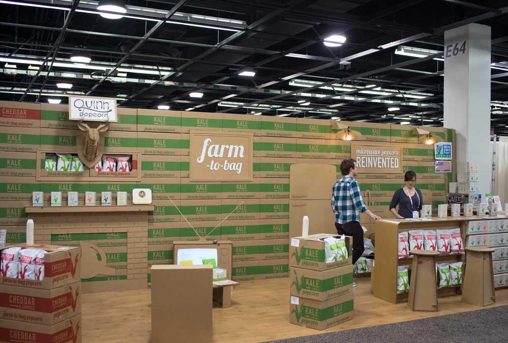
4. Quinn Popcorn
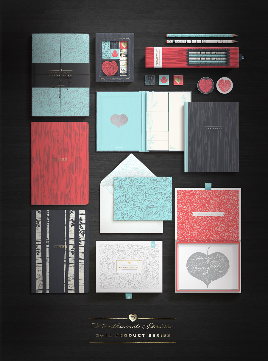
5. Woodland Series by Bookjig
Well, that’s it for now. A little to look at, something to inspire, and some goals.
& Stay Inspired


